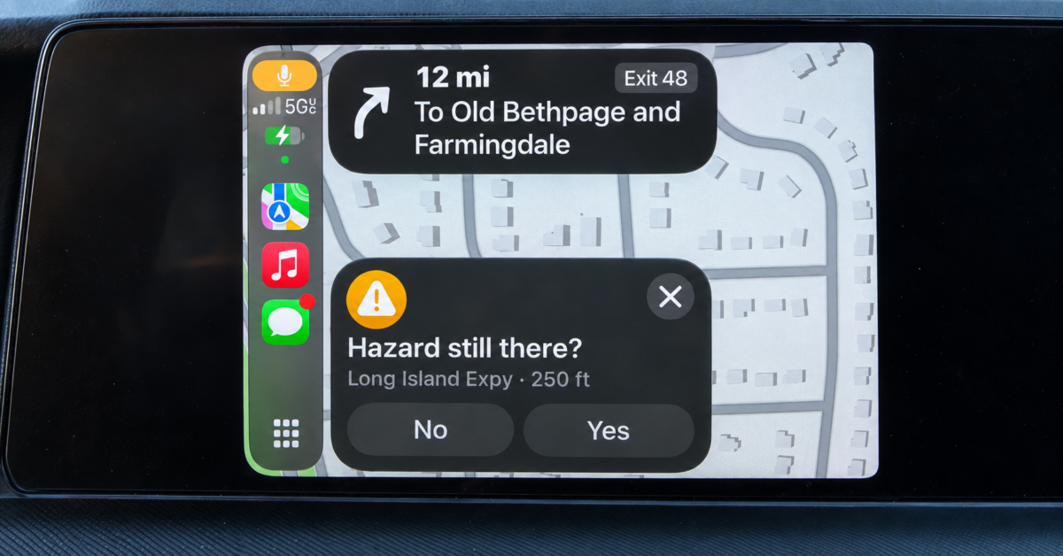
I was driving on the Long Island Expressway at 55 mph when Apple Maps presented me with a question on my CarPlay display. With a reported hazard nearby, it asked, “Hazard still there?” and offered two buttons: No and Yes.
The screen identified the hazard as just 250 feet away. At that moment, Apple should have been helping me keep my attention on the road, yet its interface invited me to read a question and provide feedback.
I understand why Apple collects this information. A warning about something that has already cleared can become useless, while confirmation that a hazard remains can help other drivers. Apple’s CarPlay documentation describes how users can update incident reports and how it evaluates those reports before removing markers.
That makes sense as a way to maintain a map. Asking for that help while someone is driving at highway speed, however, deserves scrutiny.
The placement bothered me too. In my setup, the question appeared on the left side of the display, beside the CarPlay app controls and closest to me in the driver’s seat. This was a large panel covering a substantial portion of the map, with prominent buttons inviting a response.
Could a passenger answer it? Sure, but the interface sat closest to the person operating the vehicle. The possibility that someone else could reach over does little to address the distraction it creates for the driver.
At 55 mph, a vehicle travels approximately 81 feet per second. Looking away for two seconds means covering about 161 feet while your eyes are elsewhere. With the display showing a reported hazard 250 feet ahead, that distance represents roughly three seconds of travel at a constant speed.
Those calculations do not tell us how long anyone actually looks at this prompt. They do illustrate why even a brief interaction deserves more thought than “it only takes one tap.”
Before tapping, a driver has to notice the panel, read the question, assess whether the reported hazard is still present, and choose an answer. The physical touch is only one part of that process, and the question competes with whatever is happening outside the windshield.
The National Highway Traffic Safety Administration includes interacting with navigation systems among activities that can distract drivers. Putting a question on a dashboard display does not remove that concern simply because the question relates to road conditions.
I like Apple Maps, which is why this stood out to me. I use navigation to reduce the work involved in getting somewhere, and an unsolicited request for feedback adds another decision at a moment when I already have enough to monitor.
Yes, drivers can leave the question unanswered. We remain responsible for keeping our attention on traffic, but that responsibility should also inform how Apple designs the interface. An optional prompt can still draw your eyes before you decide to ignore it.
A hazard warning has an immediate purpose: it tells you to watch for trouble ahead. Adding a request to confirm that warning asks you to help maintain Apple’s data while approaching the very location that may require extra care.
I would prefer a brief warning that clears without inviting a tap while the vehicle is moving. Apple could preserve voluntary reporting while making its navigation display less demanding, particularly at highway speeds.
My experience does not establish that this feature has caused a crash, and I cannot quantify its specific risk. What I can say is that Apple Maps presented a tappable question while I was traveling at 55 mph, with a reported hazard only 250 feet ahead.
To me, that is poor judgment in an interface drivers rely on. Accurate hazard reports are useful, but Apple should design the process around the attention driving requires.
Support independent tech journalism
NERDS.xyz is independently owned and operated. If you enjoy my coverage of Linux, AI, hardware, cybersecurity, and tech culture, consider supporting the site on Ko-fi.
Support NERDS.xyz