Web browsers keep getting dumber.
That’s honestly how it feels lately. Too many browser makers seem obsessed with stripping away options, forcing AI into everything, and turning the web into some sanitized experience where users have less control over how they browse. Thankfully, Vivaldi Technologies still seems interested in building a browser for people that actually enjoy using computers.
With the launch of Vivaldi 8.0, the company is rolling out what it calls its biggest design overhaul ever (full changelog here). Thankfully, this is not one of those redesigns where everything gets simplified into giant buttons and wasted space. Existing users can breathe easy.
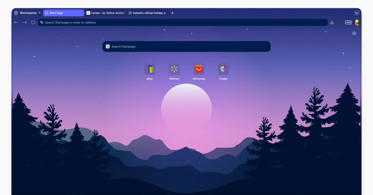
The biggest change in Vivaldi 8.0 is a new interface style called “Unified.” Instead of splitting the browser into separate visual sections for tabs, toolbars, panels, and content, everything now flows together as one continuous surface. The browser looks cleaner and more modern, but still feels unmistakably like Vivaldi.
More importantly, the redesign does not come at the expense of customization. That would have been a disaster.
Themes now spread across the entire browser window, allowing wallpapers, colors, blur effects, and translucency to feel more immersive. New built-in themes like Zen, Sunset Forest, and Soria Moria help show off the new visual direction, and frankly, some of them look pretty slick.
One thing I actually like here is that Vivaldi recognizes its biggest strength can also intimidate new users. The browser has so many options and features that it can feel overwhelming at first. Version 8.0 tries to solve that with six preset layouts users can choose during setup.
Simple gives you a cleaner experience with minimal clutter. Classic keeps the familiar Vivaldi layout longtime users already know. Vertical Left and Vertical Right are designed for people that prefer side tabs, especially on widescreen monitors. Auto Hide pushes interface elements out of the way until you need them. Bottom moves tabs and navigation controls beneath the webpage itself.
Unlike Chrome, Edge, or Safari, Vivaldi still seems perfectly comfortable letting people browse however they want. That alone makes it feel refreshing in 2026.
The company also takes a subtle swipe at the AI obsession infecting the browser market. While competitors increasingly use AI to decide what users should see, Vivaldi says it prefers building tools that give users more control instead. As someone that’s getting tired of AI being jammed into every product on earth, I appreciate that approach.
And yes, the browser still includes all the nerdy power-user features Vivaldi fans expect. Tab tiling remains one of the best features in any browser today. Tab stacks, synced tabs, built-in mail, notes, calendar support, reading lists, and deep interface customization are all still here.
Linux users especially will probably appreciate that Vivaldi continues to embrace the idea that computers should adapt to humans, not the other way around. That philosophy feels increasingly rare.
Vivaldi 8.0 is available here now for Windows, Mac, and Linux, and unlike many modern redesigns, this one actually feels like it respects the people using it.
Support independent tech journalism
NERDS.xyz is independently owned and operated. If you enjoy my coverage of Linux, AI, hardware, cybersecurity, and tech culture, consider supporting the site on Ko-fi.
Support NERDS.xyz